Gap Intelligence is a highly respected business intelligence services company providing product pricing and placement information to some of the world’s biggest brands and manufacturers.
My Role
〉Head of UX & Design
〉Unification & modernization of brand identity
〉Internal and external user testing & research
〉UX design for all web & mobile interfaces
〉Optimization of critical internal processes
〉Photography & videography of company events
Results
〉Conducted user study of 300+ client users resulting in UX overhaul of customer webapp
〉Designed/developed a new public website, migrating from proprietary CMS to WordPress
〉Improved analyst team workflows saving approximately 500 hours of labor annually
〉In-person study of 14 contractors across US
〉Mentored 3 junior front end engineers
A “gap” in design thinking
Despite over a decade of success, Gap Intelligence found itself in need of design leadership as its brand started to show its age.


Survey says…
My first undertaking at Gap was to spearhead a survey of existing customers. The survey consisted of approximately 20 questions intended to ascertain what Gap was doing well, what we weren’t doing well, and general sentiment for our company.
The results of the survey required little interpretation: customers loved the raw data we provided them but did not love the products and webapp we offered.


“Do you guys build rockets or something?”
The most glaring feedback from customers was regarding the public-facing website. Customers left countless comments with the same sentiment: “your website is confusing and makes it seem like you build rockets or something”.
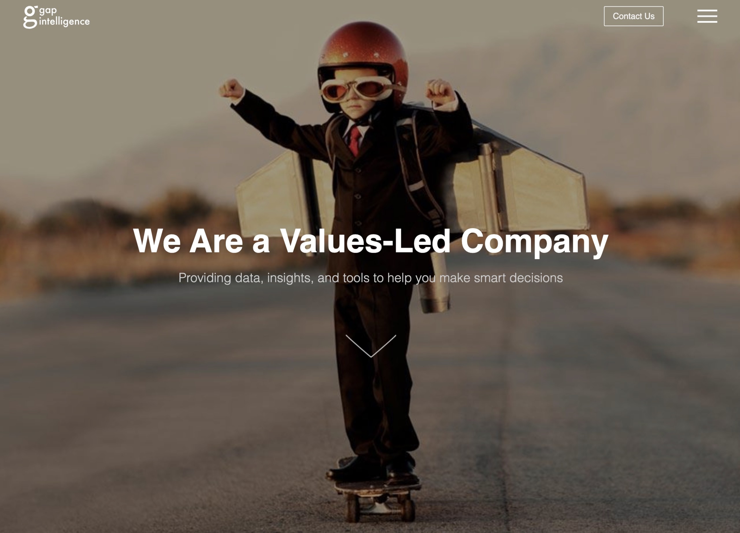
Gap Intelligence previous homepage
Reimagined web presence
Taking the (quite hilarious) customer feedback to heart, I successfully lobbied leadership to prioritize a new public website and to replace the proprietary CMS it was built on with WordPress. Upon getting the green light, I volunteered to design and develop the website myself in addition to my regular duties.
My primary goal was to clarify Gap’s value proposition and significantly reduce the homepage’s abysmal bounce rate. I rectified this with videos of our actual data collectors in the wild and large, concise headings that were easily skimmed.
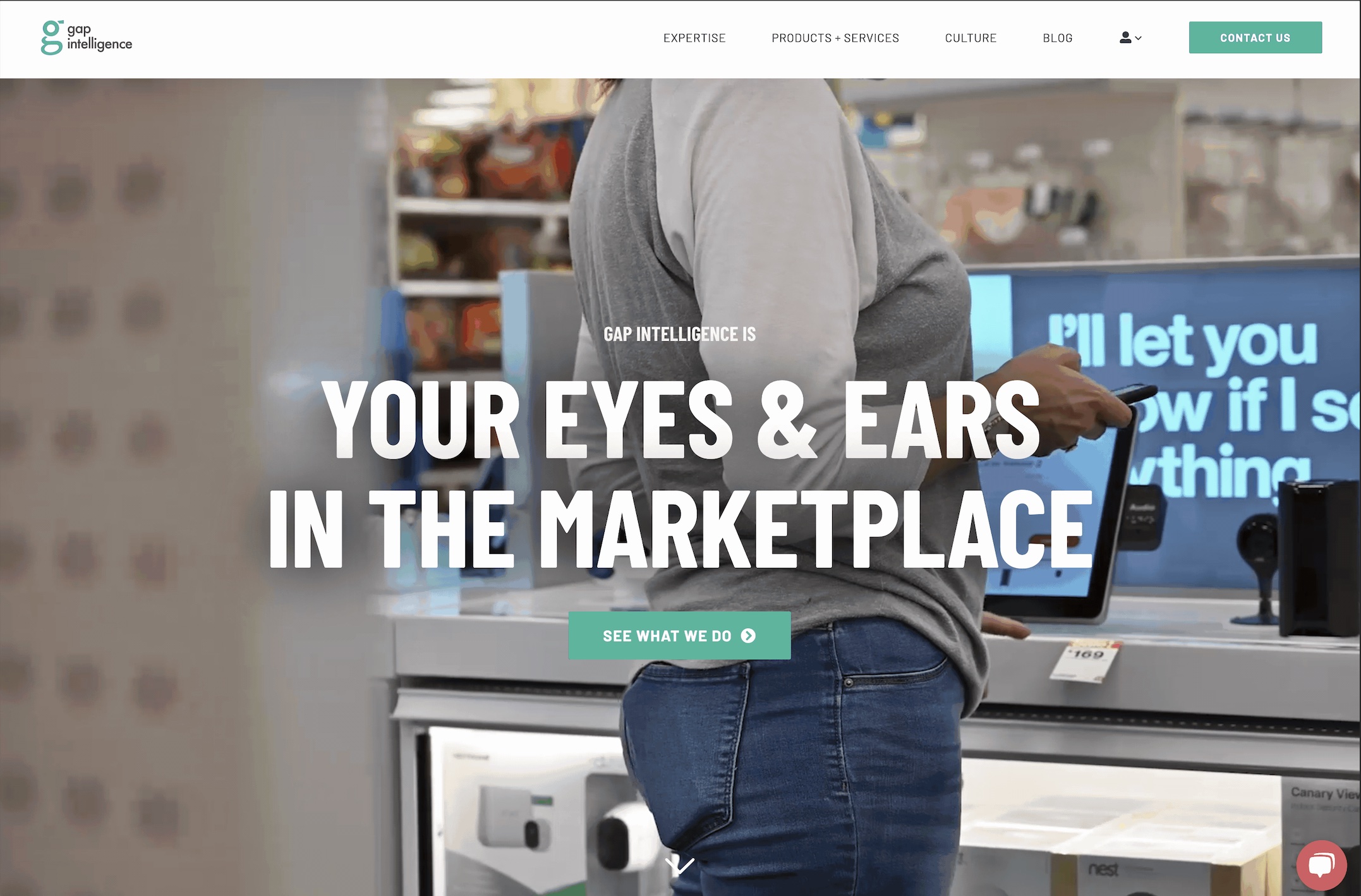
Unambiguous value proposition & offering
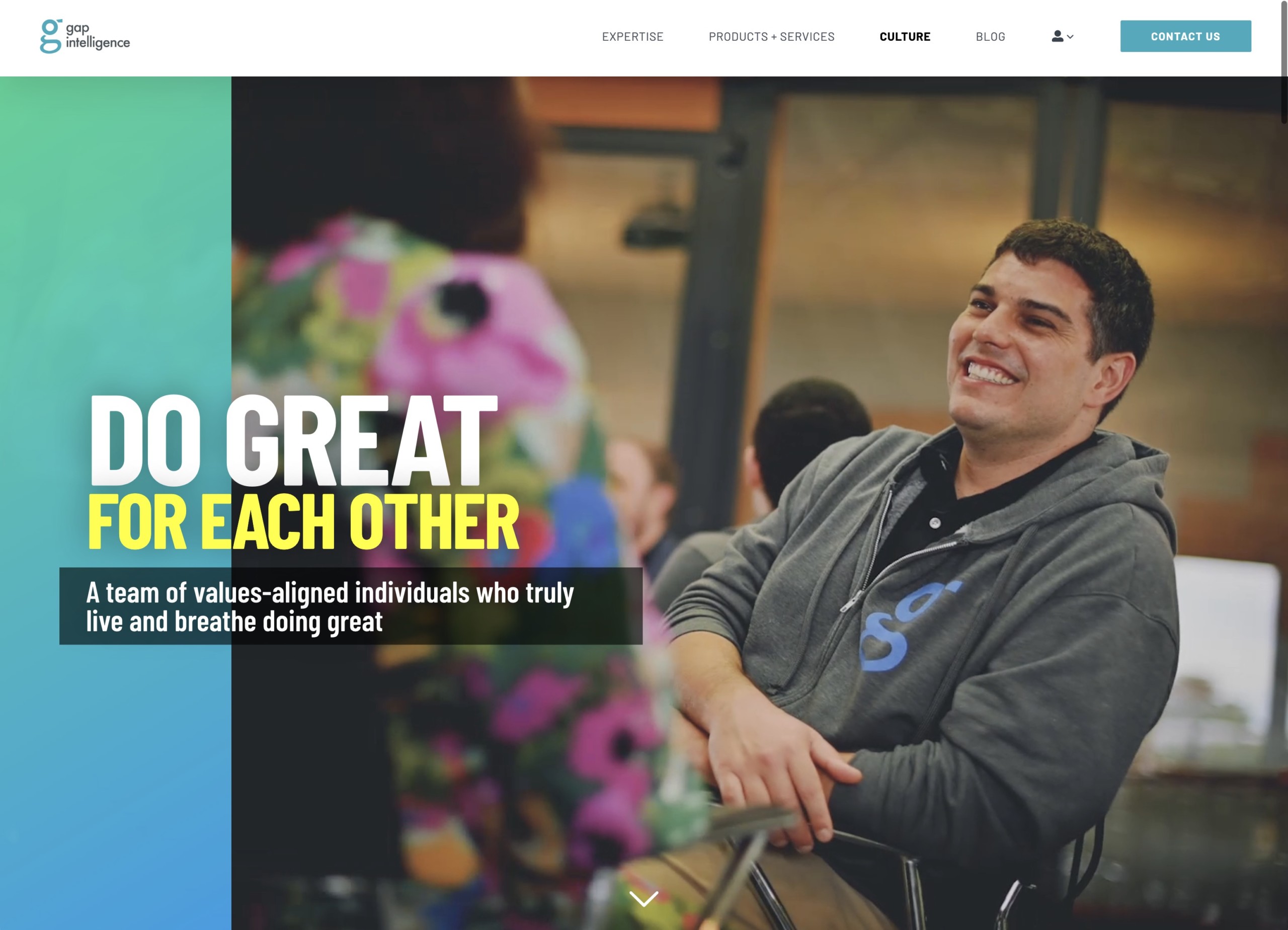
To better articulate Gap’s value proposition and product offering, I added videos and images (which I personally shot) of the analysts that our customers communicate with on a daily basis, being sure to capture the team’s personality.
After reducing the volume of text and improving the language, I broke up the previously busy-yet-monotonous website content by varying the layout of adjacent sections and highlighting the most important points with interactivity, color and prominent headings.

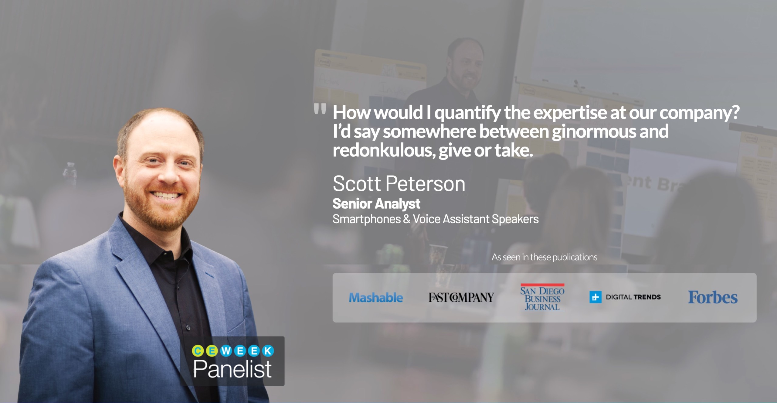
Highlight Gap’s great culture and personality
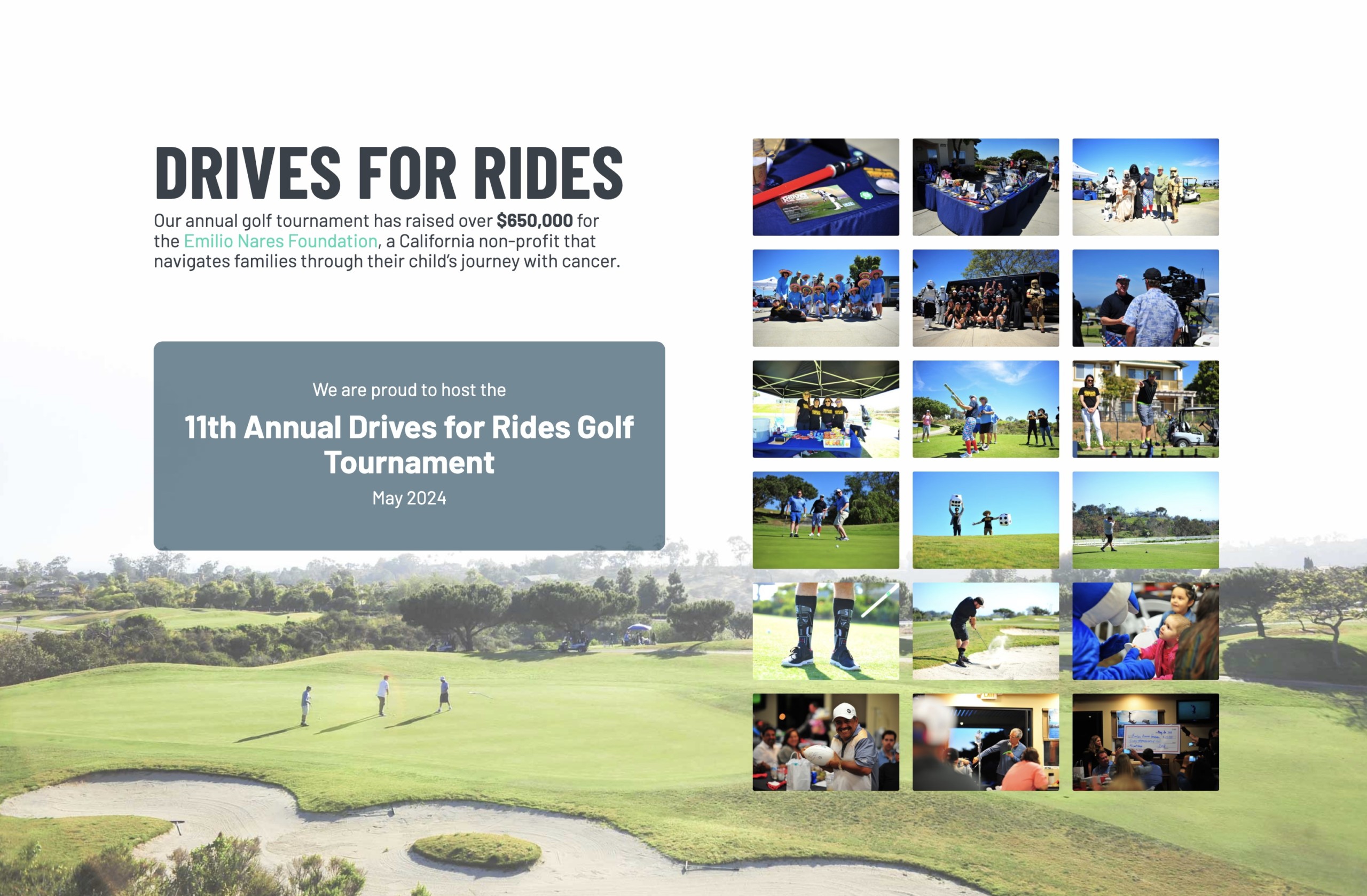
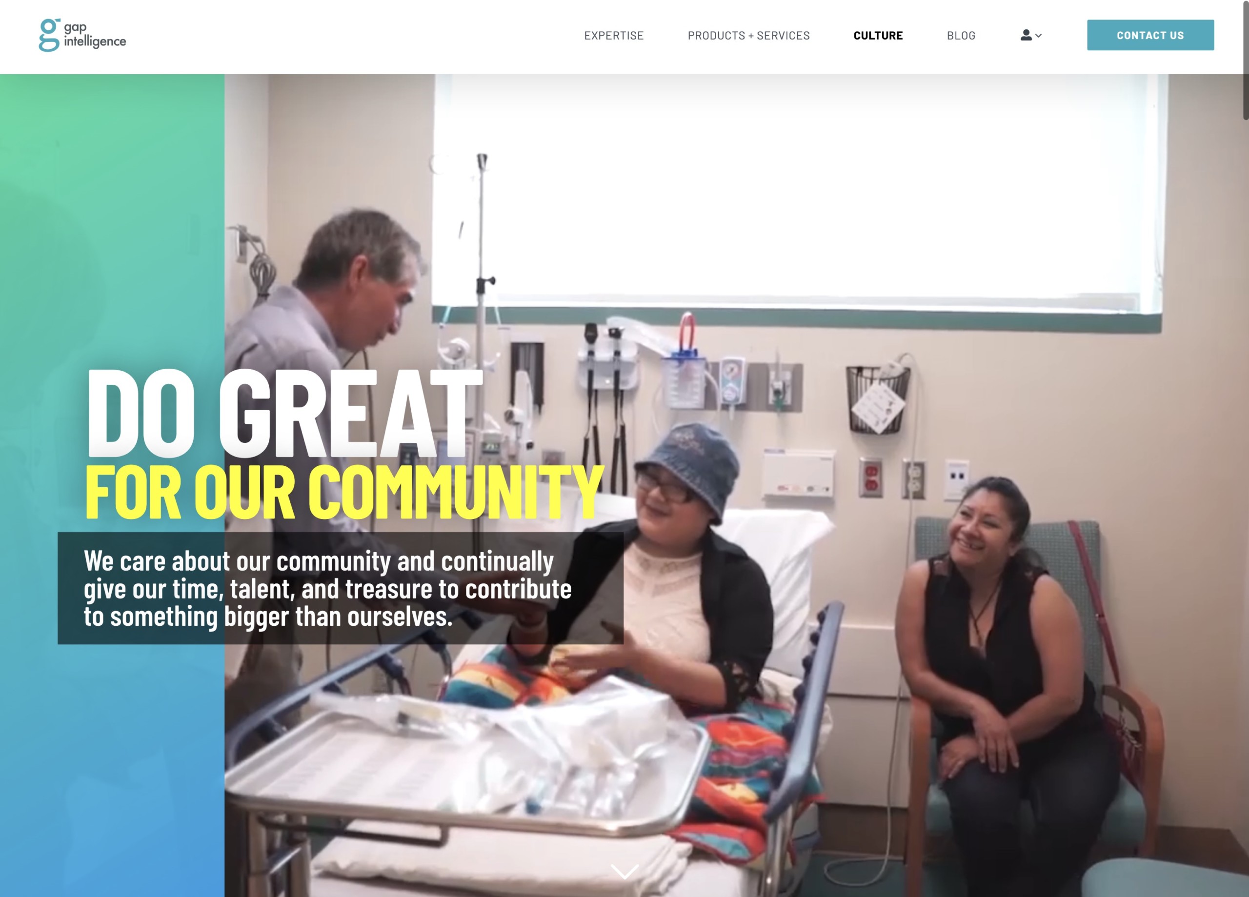
Gap’s company culture was one of genuine teamwork, fun and drive to give back to the community. While the previous website talked about that culture with cookie-cutter icons, I wanted to truly illustrate that culture with photos & videos of the team in action.
Gap’s annual fundraiser Drives for Rides has raised over $650,000 for the Emilio Nares Foundation which provides free transportation to medical treatments to underserved children with cancer. It was a no-brainer to highlight this exceptional statistic on the new website.

Internal process optimization
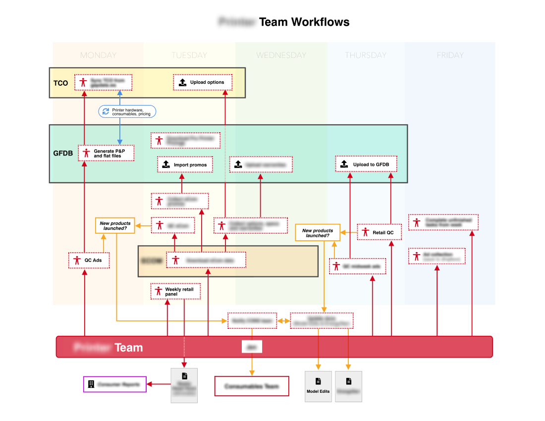
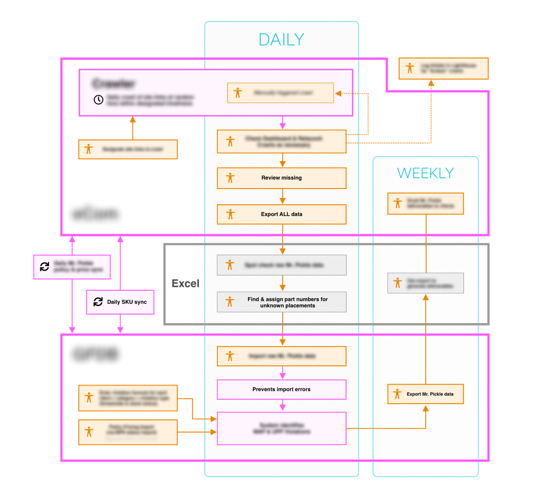
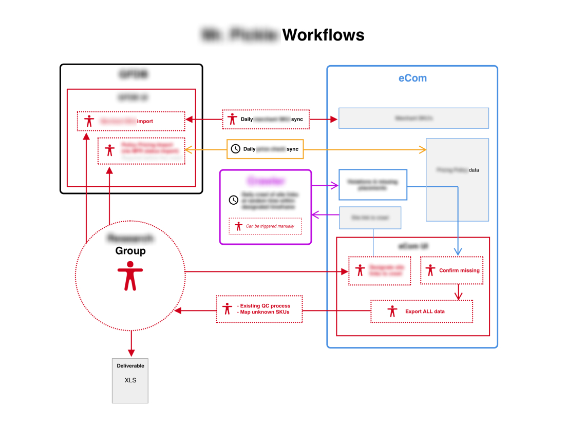
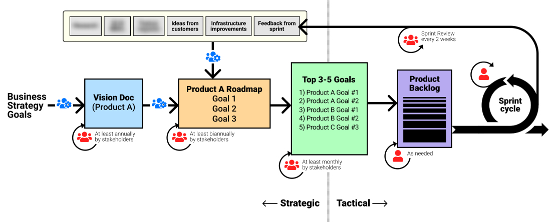
Problem: Many of Gap’s internal processes were conducted via spreadsheets and laborious manual human entry, and many of these processes were undocumented. As such, onboarding of new employees was always a long, arduous endeavor that lead to a lot of churn.
Solution: To rectify this lack of clarity, I identified the most critical processes and interviewed the employees directly involved with each workflow. After weeks of interviews and feedback, I produced a handful of workflow diagrams and SOP’s that were then disseminated to employees involved.
Showcasing our expertise
With extra time available thanks to newly streamlined processes, the team was able to focus on new initiatives aimed at driving social media traffic and showcase our data analysis expertise.
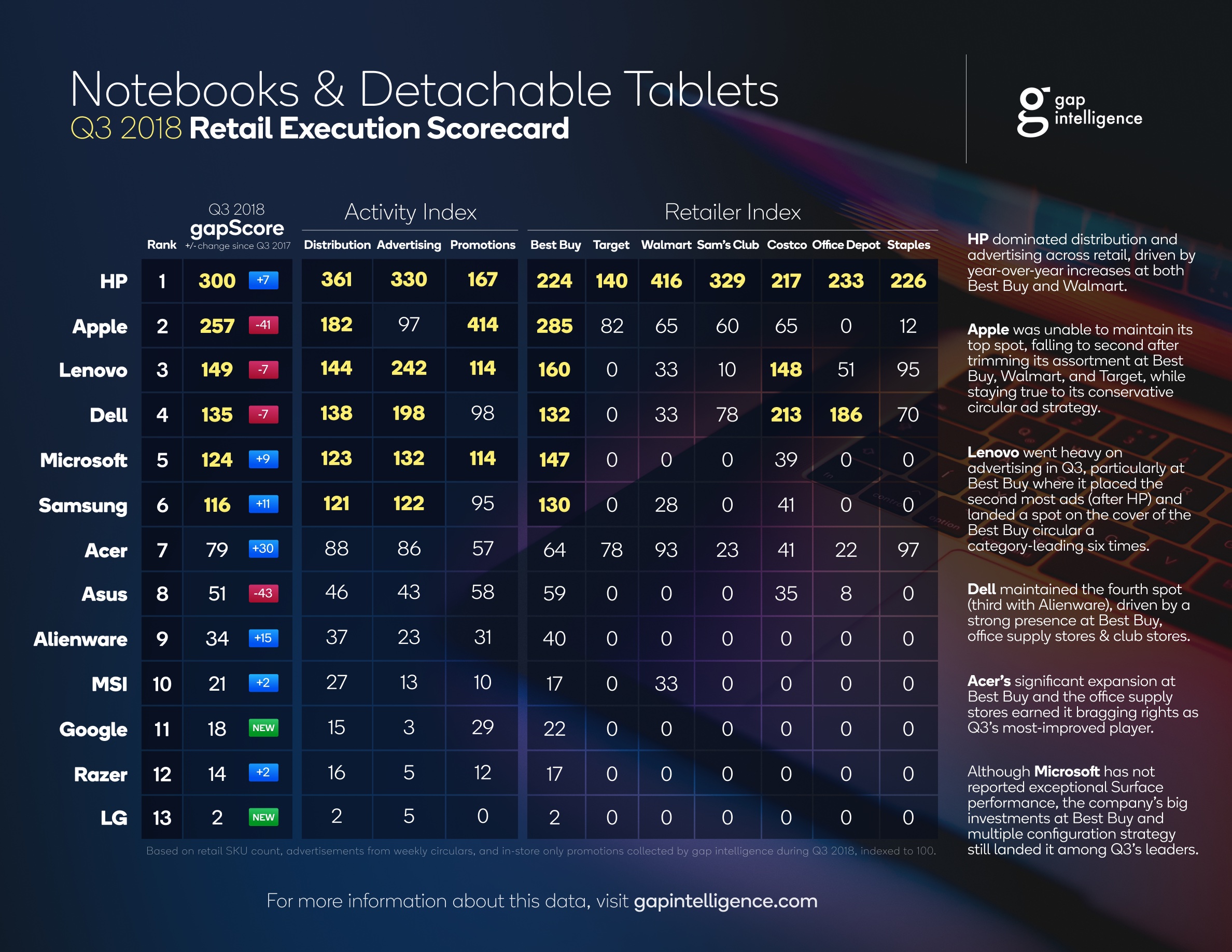
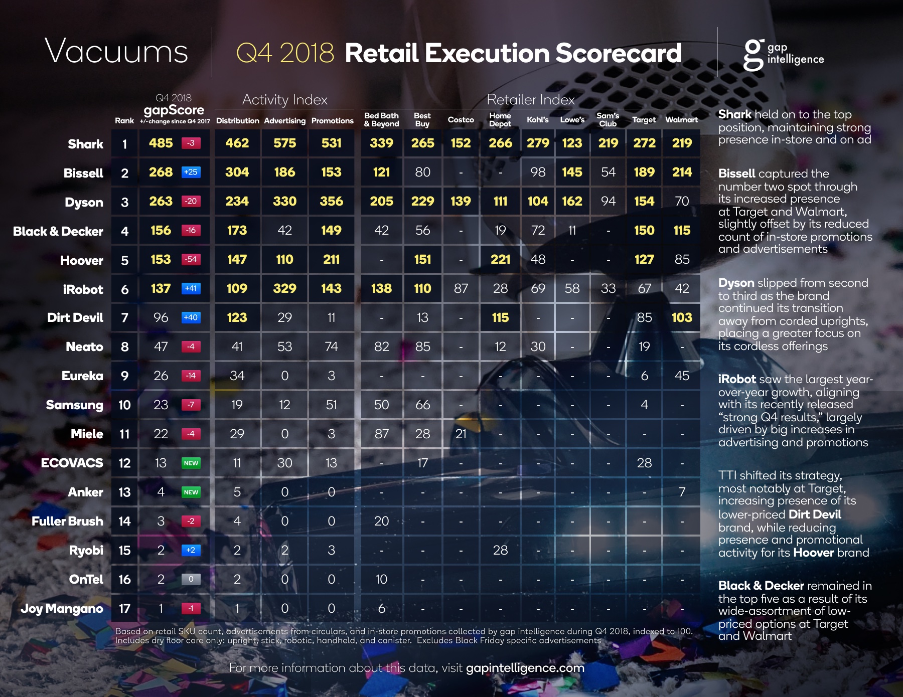
One such initiative was “Gap Retail Execution Scorecards” which provided a unique view of the landscape within specific product categories. Working closely with the data analyst team, I designed a template that enabled the team to produce new scorecards each quarter with minimal effort. The very first scorecard Gap published proved to be our most engaging social media content ever.
Improved brand touchpoints
Another initiative was to improve the open rates and utilization of emails sent to customers.
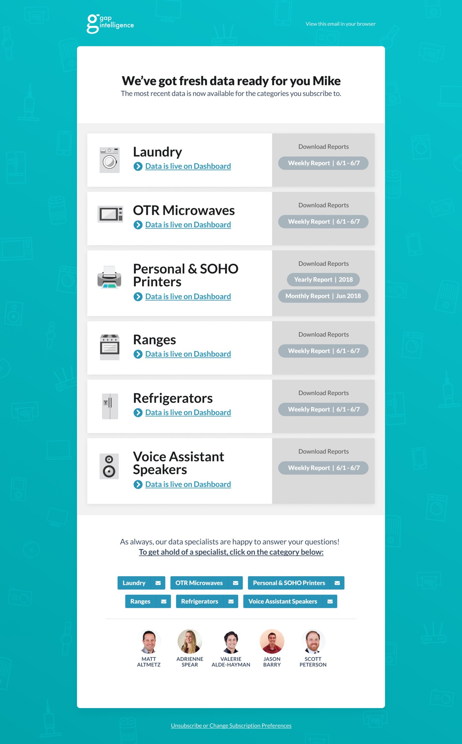
Harnessing the results from the customer survey conducted earlier in the year, I deduced that the existing emails felt sterile to customers and lacked the “human touch” that Gap prided itself on. To remedy this, I added headshots of all analysts involved in procuring the emails.
Additionally, to give the emails more “life”, I added a new playful background with more vibrant colors and completely redesigned the company’s set of category-specific icons. The results of these changes were significant: 44% increase in the click-through rate of the weekly “Price & Promotions” email and a reduction in the number of emails sent to our customer support team.
