Cramer Group Brand Refresh
Prominent Las Vegas real estate company The Cramer Group approached me with an initiative to update their aging brand identity.


Cramer Group Brand Refresh
Prominent Las Vegas real estate company The Cramer Group approached me with an initiative to update their aging brand identity.
Evolution vs. Revolution
The client’s stated goal was to evolve the existing brand identity rather than completely replacing it: “more of an evolution than a revolution”.
Additionally, the client expressed a desire to create a “premium brand” that felt “modern and somewhat niche”.

Brand Inspiration
The client provided an eclectic list of “premium” brands he had an affinity for.
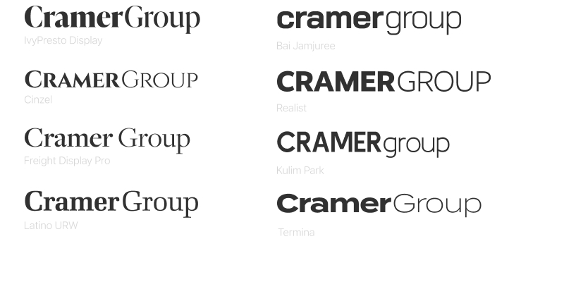
Typography
Taking the brand inspiration into account, I presented a handful of typography options including variations on capitalization, font weight and kerning.
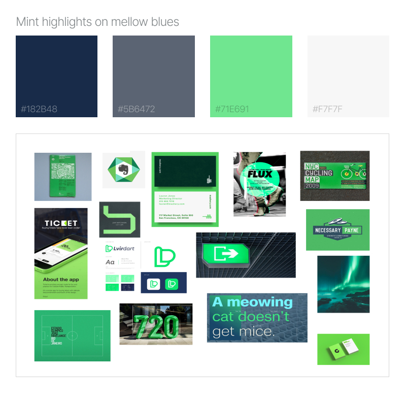
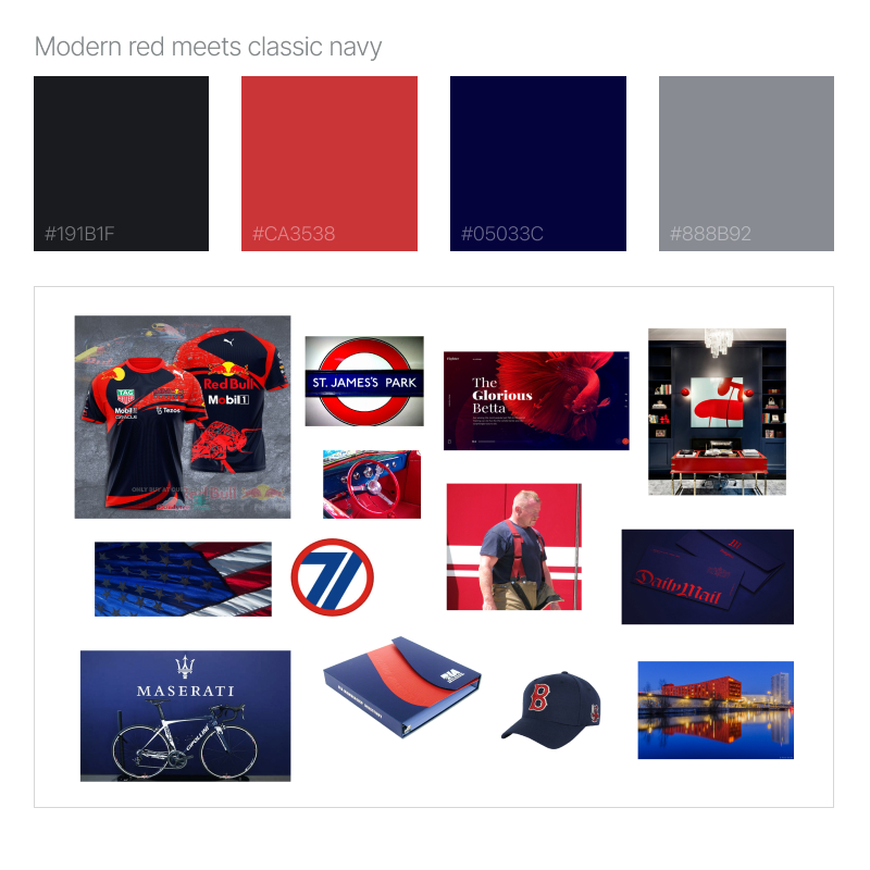
Color palette
After numerous broad color palette explorations, the client selected his 2 favorites.
“Mint highlights on mellow blues” centered around a pleasing mint green and understated blue tones.
“Modern red meets classic navy” stayed closer to the brand’s existing palette while adding some richness and depth.
Logo mark explorations
After deep consideration of the client’s stated preferences, I presented an initial round of logo explorations that aimed to maintain the simple house shape while still embodying an “evolution” of the existing mark.
Note from Mike: I strongly prefer to present first round explorations in gray (or other solid color). Do this mitigates any biases the viewer might have in regards to color and instead allows them to make a selection based on the content instead.
…now with color!
Upon submitting the initial logo explorations in grayscale, the client specifically requested that I supply examples of these logos along with both text and color.
Note from Mike: I would generally reserve this level of detail until all discreet facets of the logo had been selected (logo mark, typography & color). However, in order to accommodate clients with trouble visualizing design elements, I’m always happy to provide collateral that works for them.


