Mike MacDonald

MyTotalHealth

MyGiHealth

Helping patients understand their gut, with two of the world’s top gastroenterologists.

Role
Lead product designer & front-end engineer
Platforms
iOS, web, print
MyGiHealth: the pitch deck cover, the iPhone app and the marketing site together
+35
point NPS lift
Six-figure
investment from Nestlé Health Science
25,000+
respondents to the largest GI survey ever conducted

Overview

Rebranded MyTotalHealth’s family of products, redesigned the iOS and web apps, and built the pitch deck that won a six-figure investment from Nestlé Health Science.

My role

  • Lead product designer and front-end engineer
  • Brand identity for several sibling companies
  • Company website, web app and mobile app
  • Pitch decks and all print collateral

Results

  • Successful execution of the largest GI survey ever conducted, with over 25,000 respondents across the US
  • Public launch of the consumer web app and mobile app
  • Clinical app launched for GI doctors
  • Pitch deck resulting in a six-figure investment from Nestlé
Brand

Brand identity or identity crisis?

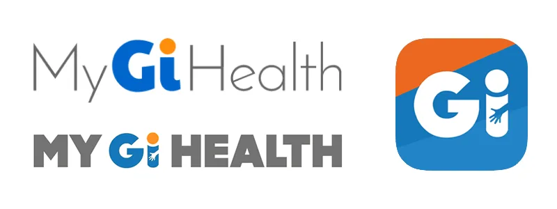
The existing brand was incoherent and occasionally puzzling. Customers liked to point out the hand in one logo that appeared to be groping the letter “i.”

Before
The old GiHealth logos before the rebrand
The existing logos
After
Three sibling shield marks for MyGiHealth, MyRheumHealth and MyUroHealth
One system across MyGiHealth, MyRheumHealth and MyUroHealth
The mark

Logo explorations

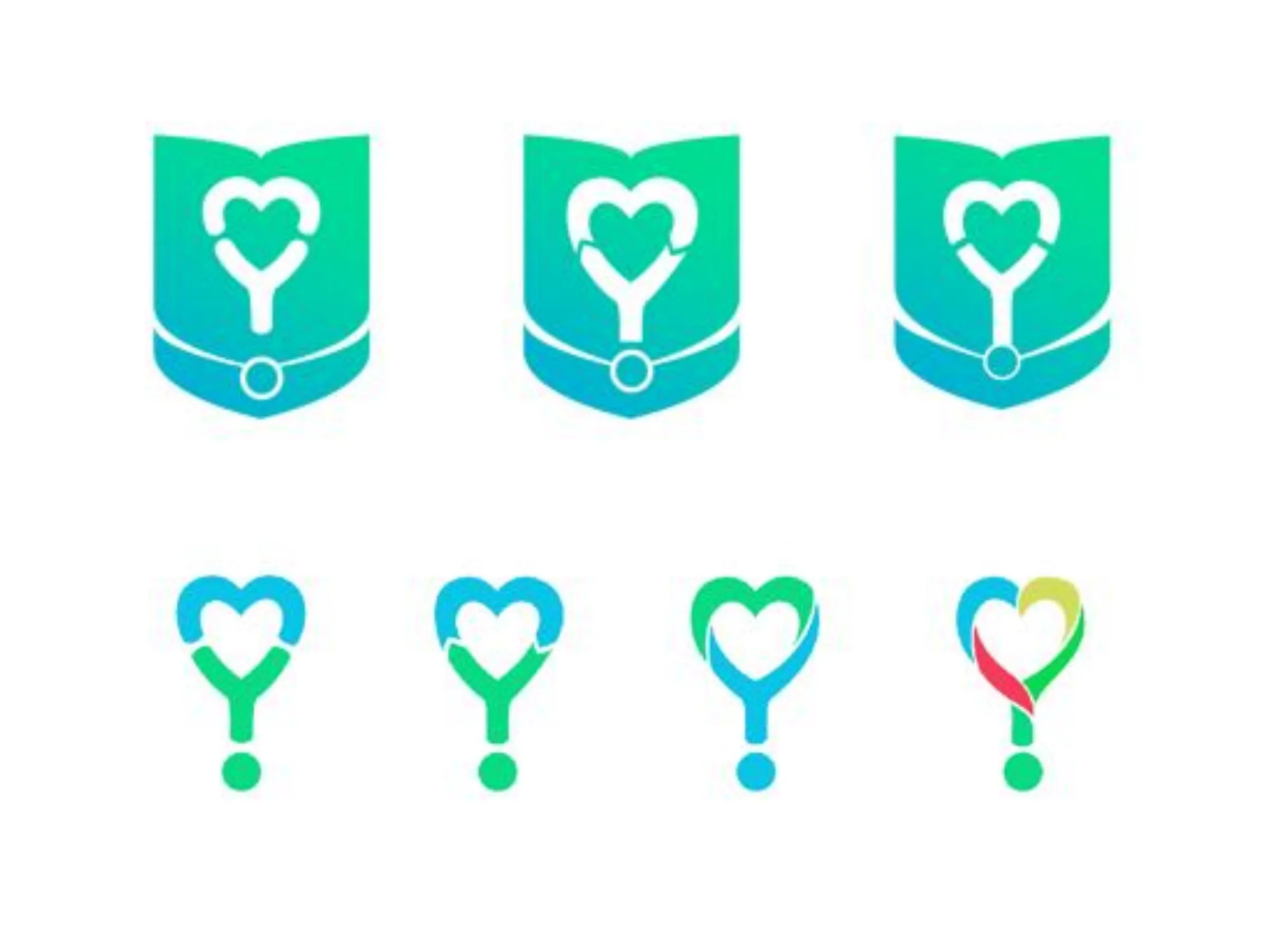
A stethoscope forming the word “my” turned out to also form a heart. Straight-edged badges felt stiff; a softer badge with edges that flowed, vaguely like wings, won.


Logo exploration in color: three badge shapes above four stethoscope hearts
Badge and stethoscope-heart variations in color
The final MyGiHealth logo
Final mark, later adapted across the MyTotalHealth family
The app

A flagship app nobody used

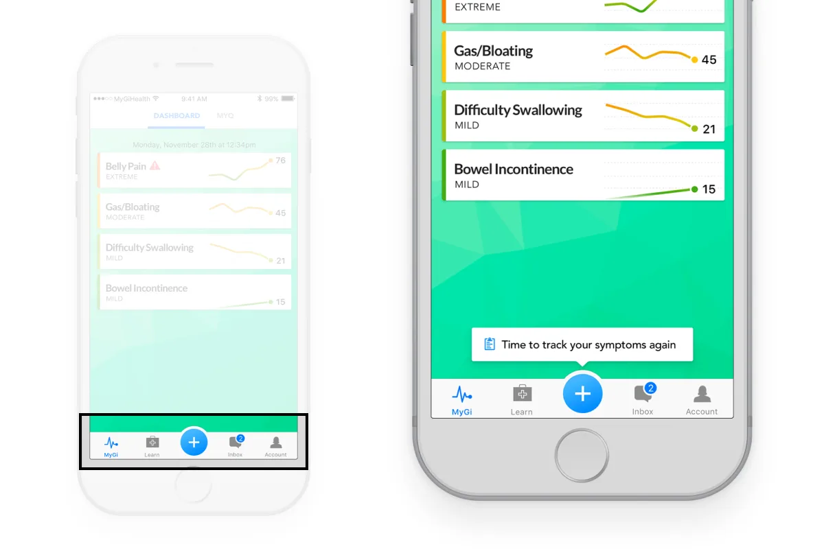
The iOS app had sat in the store largely unused for two years. The feedback boiled down to one thing: no clear guidance or calls to action. I got the team to agree on the one action that mattered, daily symptom surveys, and built the navigation around it.

Before
The original MyGiHealth app: an education screen with a body diagram
Education
The original MyGiHealth app: the start of the My GI Symptoms questionnaire
Questionnaire
After
MyGiHealth 2.0: the welcome screen
Welcome
MyGiHealth 2.0: one hub for the symptom tracker, the quality-of-life survey and doctor visit preparation
Report your progress
MyGiHealth 2.0: a symptom checklist with one symptom selected
Symptom survey
Detail of the redesigned tab bar: a prominent center button and a prompt to track symptoms again
Navigation built around one action
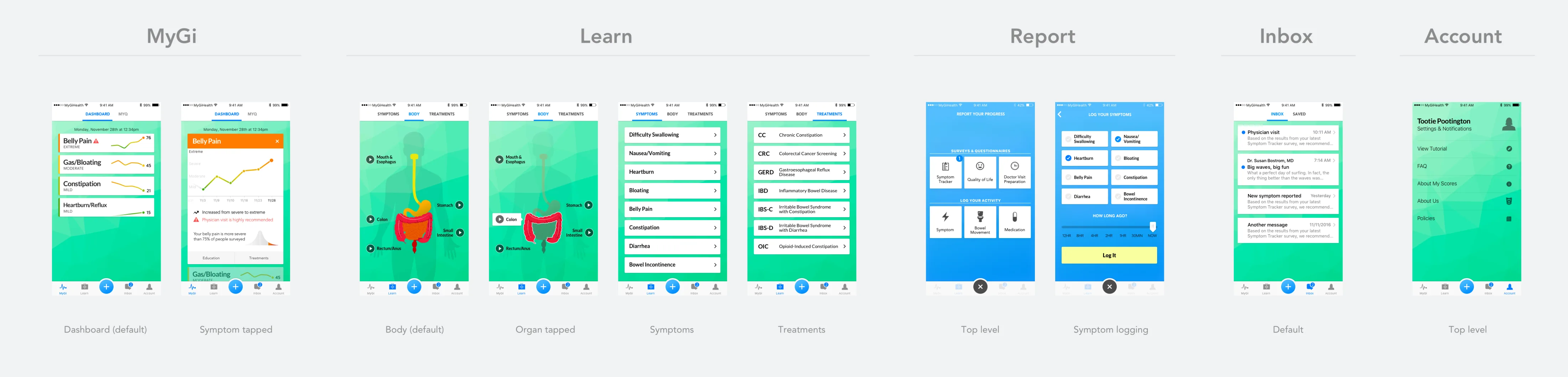
Board showing every view of the MyGiHealth app grouped under MyGi, Learn, Report, Inbox and Account
Every view in the redesigned app, grouped by tab
Survey

Survey

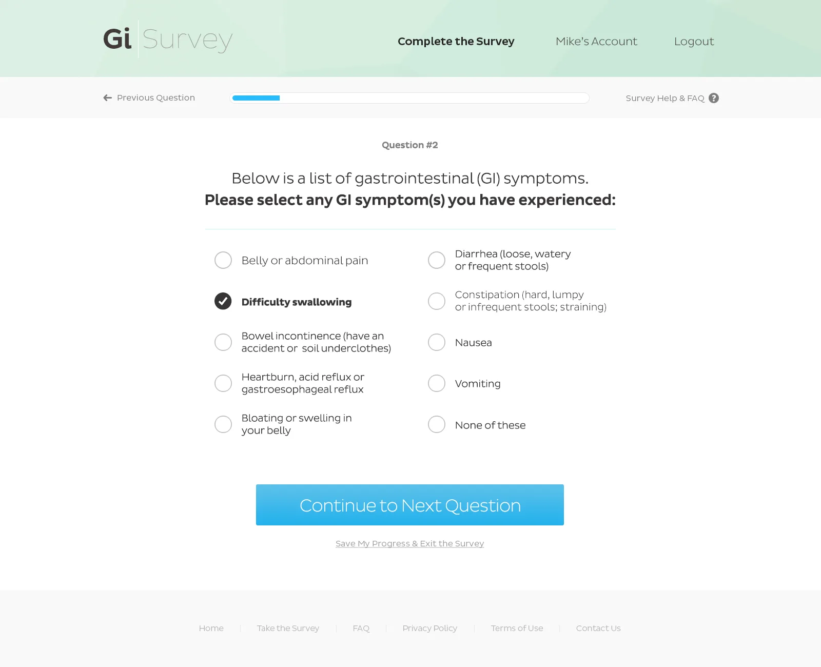
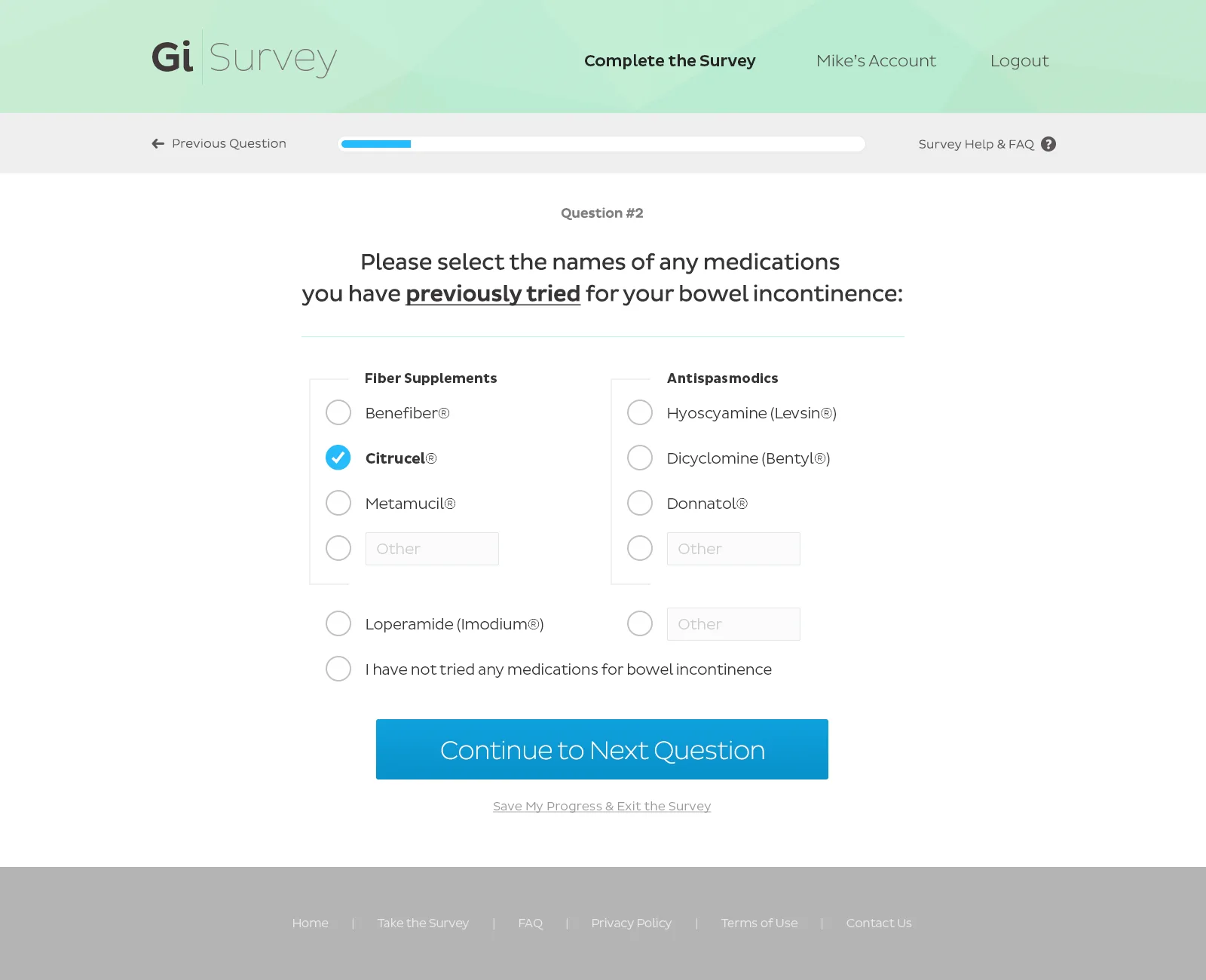
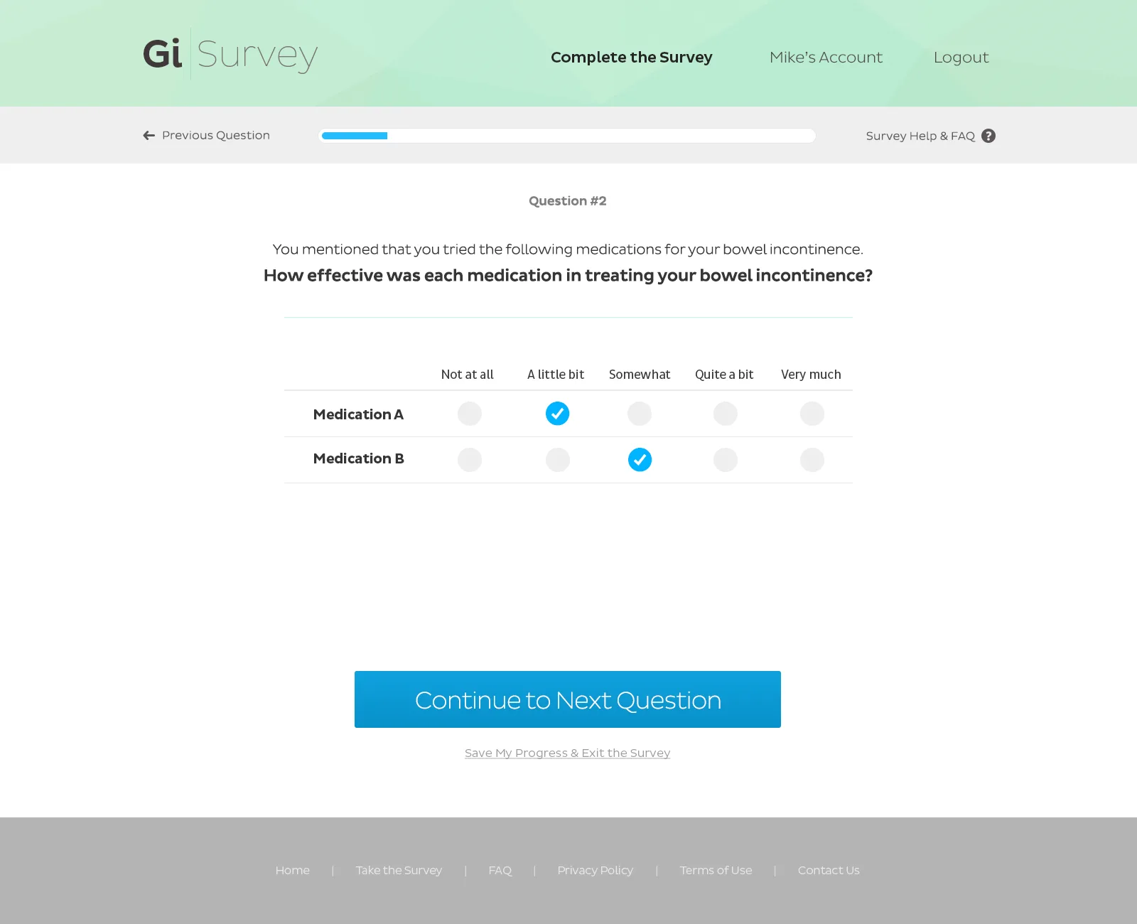
I designed all UI/UX, creative and marketing materials for the largest gastrointestinal survey ever conducted, as its sole UX/UI designer, and built the front end in React.

It was executed successfully, with over 25,000 respondents across the US.
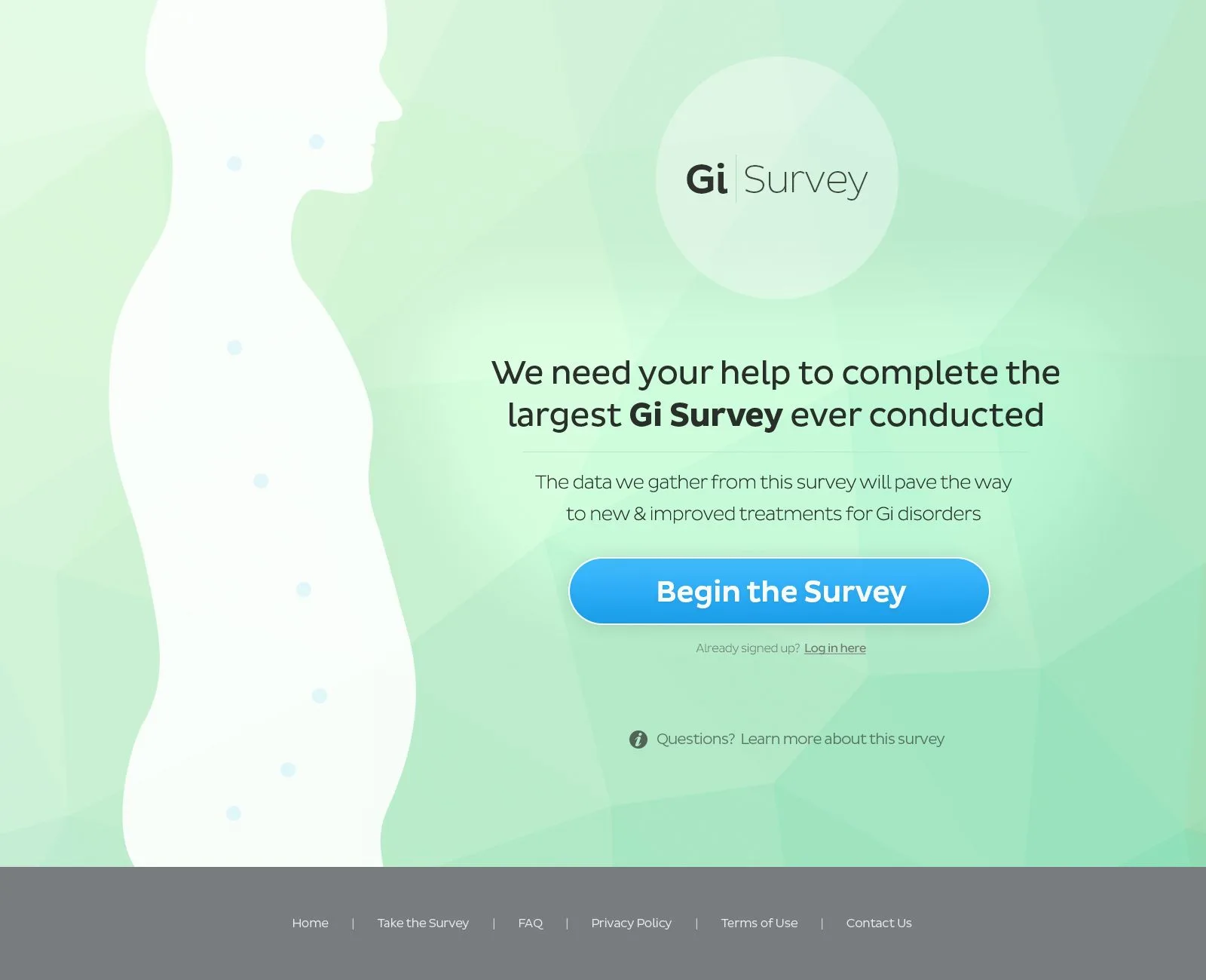
GI Survey landing page: “We need your help to complete the largest GI Survey ever conducted”
Landing page
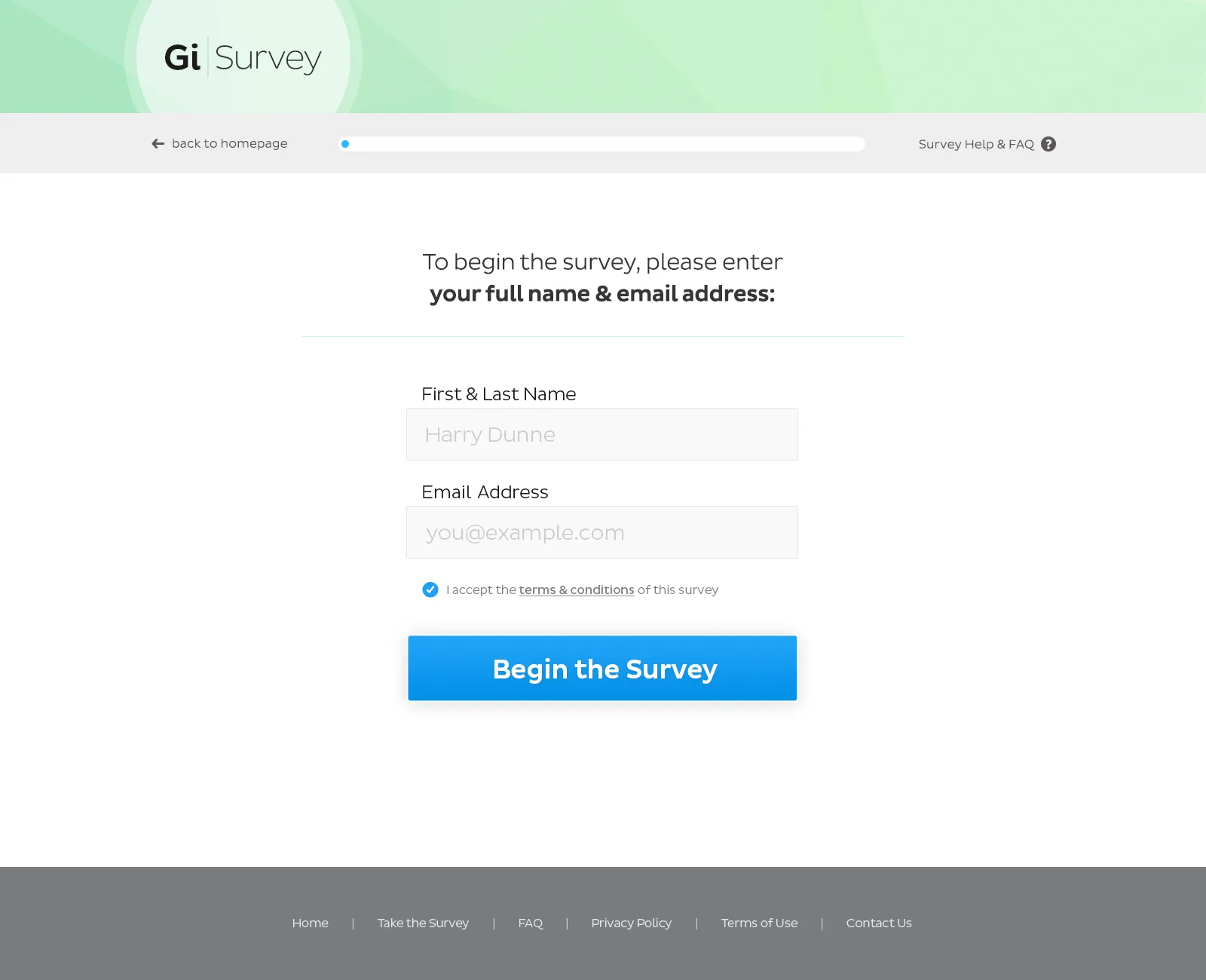
GI Survey registration: name, email and a Begin the Survey button
Registration
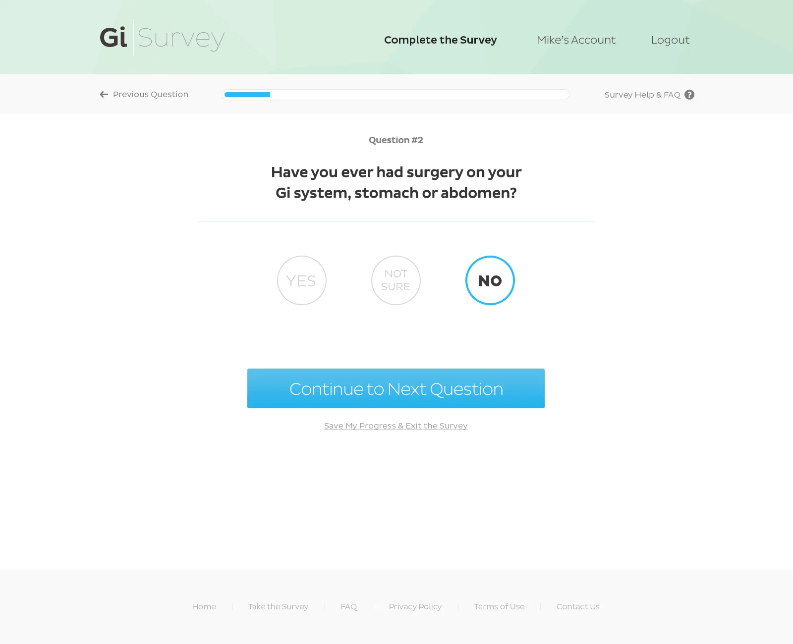
GI Survey: a yes, no or not sure question
Yes, no or not sure
GI Survey: a multiple-choice list of symptoms
Multiple choice
GI Survey: a grouped multiple-choice question
Grouped multiple choice
GI Survey: a matrix question
Matrix questions
Data viz

Data people could read

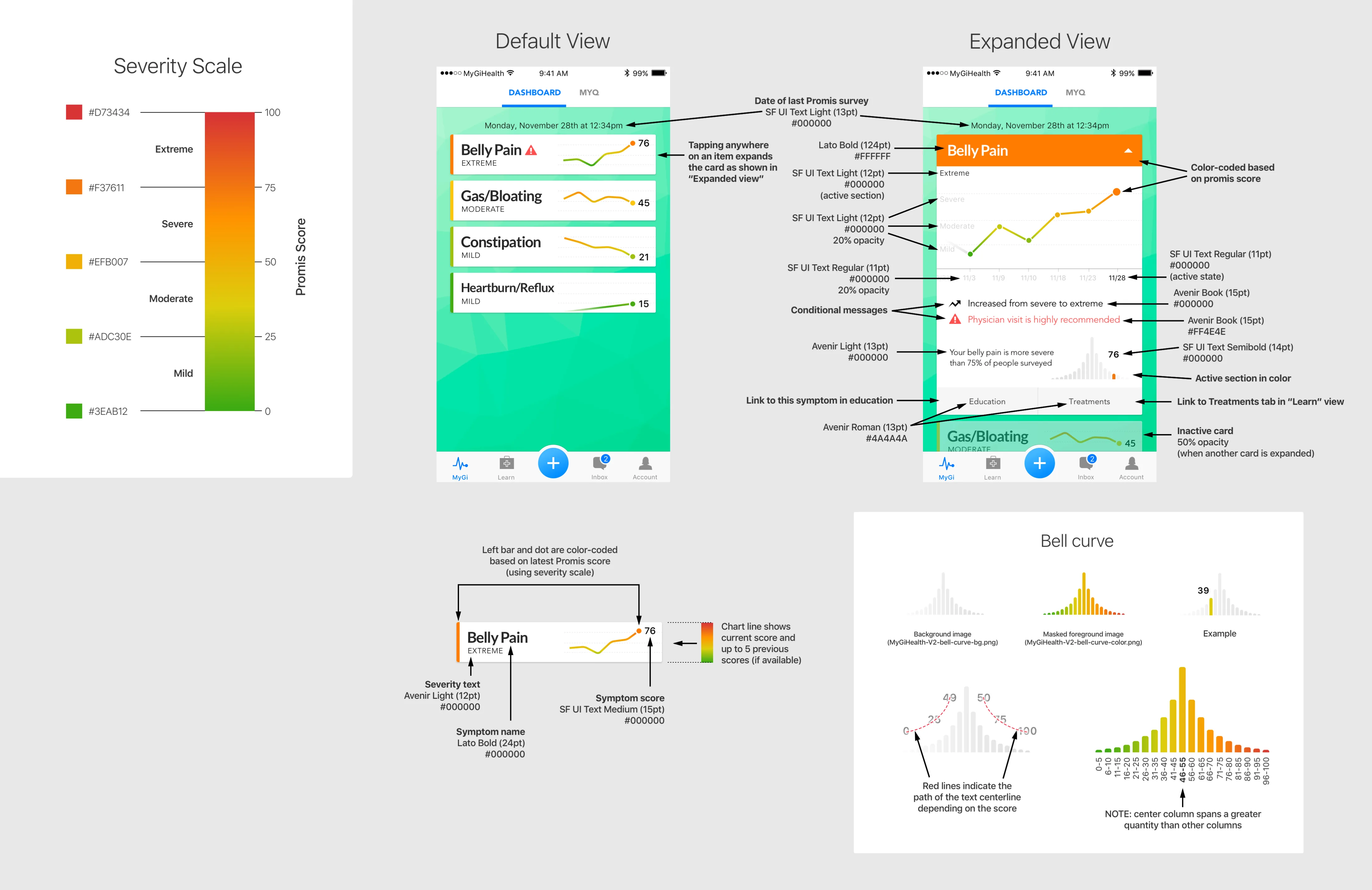
Despite initial pushback from the founding doctors, I insisted on redesigning every chart. Patients could finally see symptoms progress over time, at a glance, on a palette that read as severity.

Before
The original app: a list of symptom scores with thin bars
Scores
The original app: a red-to-green chart of scores compared with other people
Chart
After
MyGiHealth 2.0: a dashboard of symptom cards, each with a severity label, a trend line and a score
Dashboard
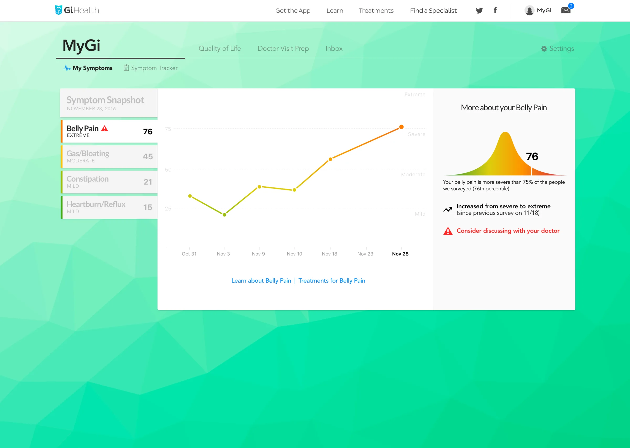
MyGiHealth 2.0: belly pain over time on a severity-colored line, with a bell curve comparing the score with everyone surveyed
A symptom, expanded
Annotated specification for the MyGiHealth dashboard charts
Chart specification: severity scale, card states and the bell curve
The clinic

Doctor and patient, connected

Once a patient picked their GI doctor, survey results could go straight to the clinic in real time, as a report a physician could read in a minute.
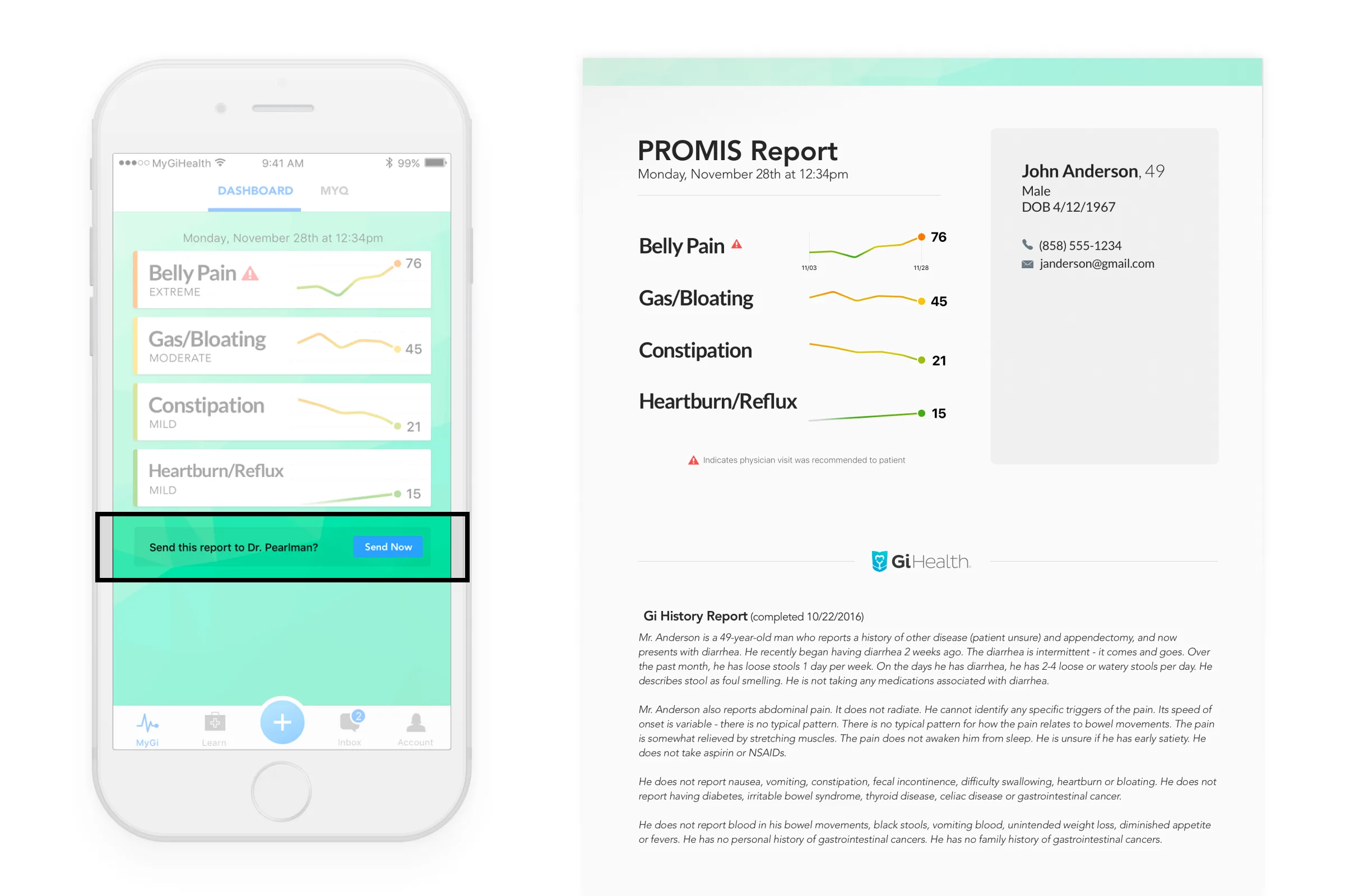
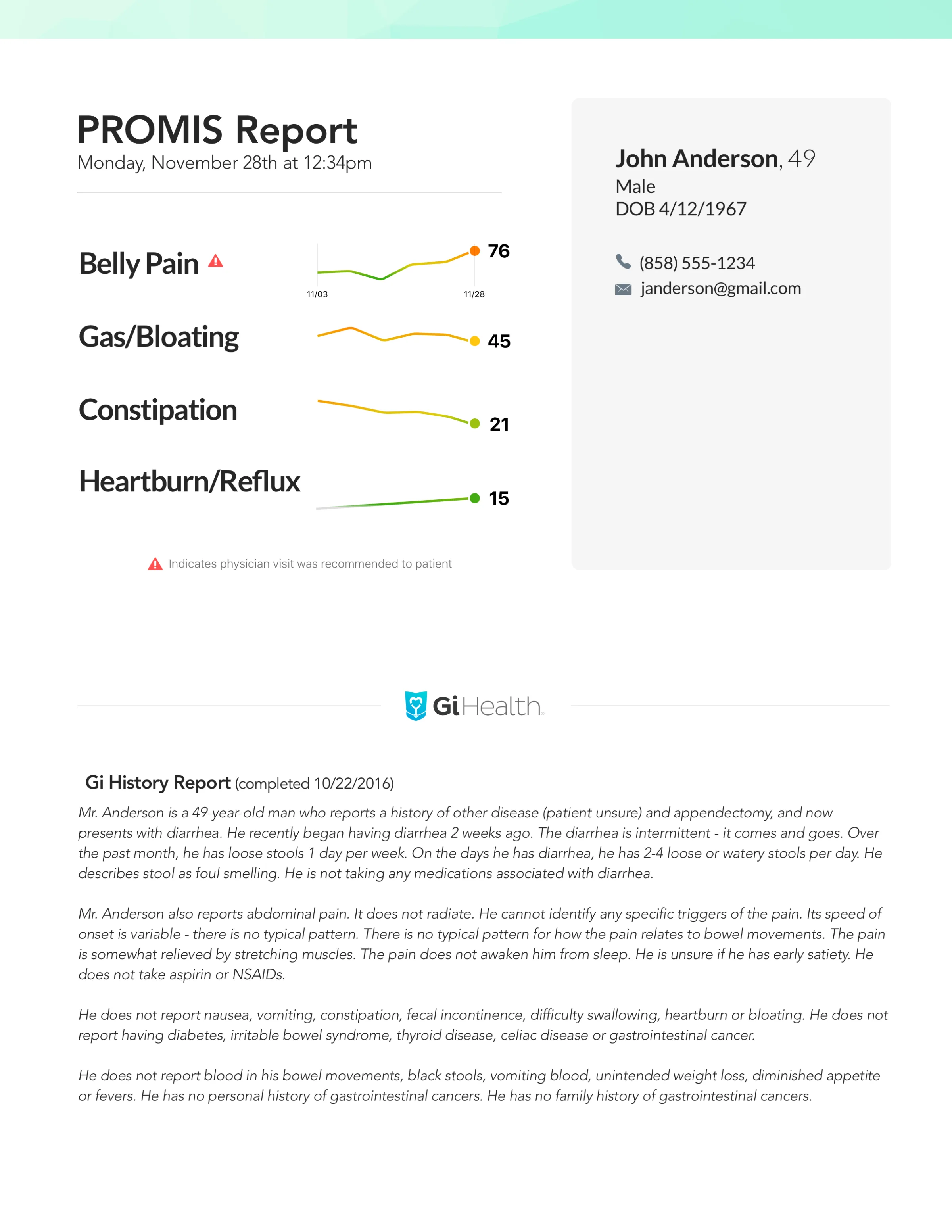
MyGiHealth app: sending results to a doctor, beside the report it produces
Send to doctor
The PROMIS report a physician receives
Doctor report
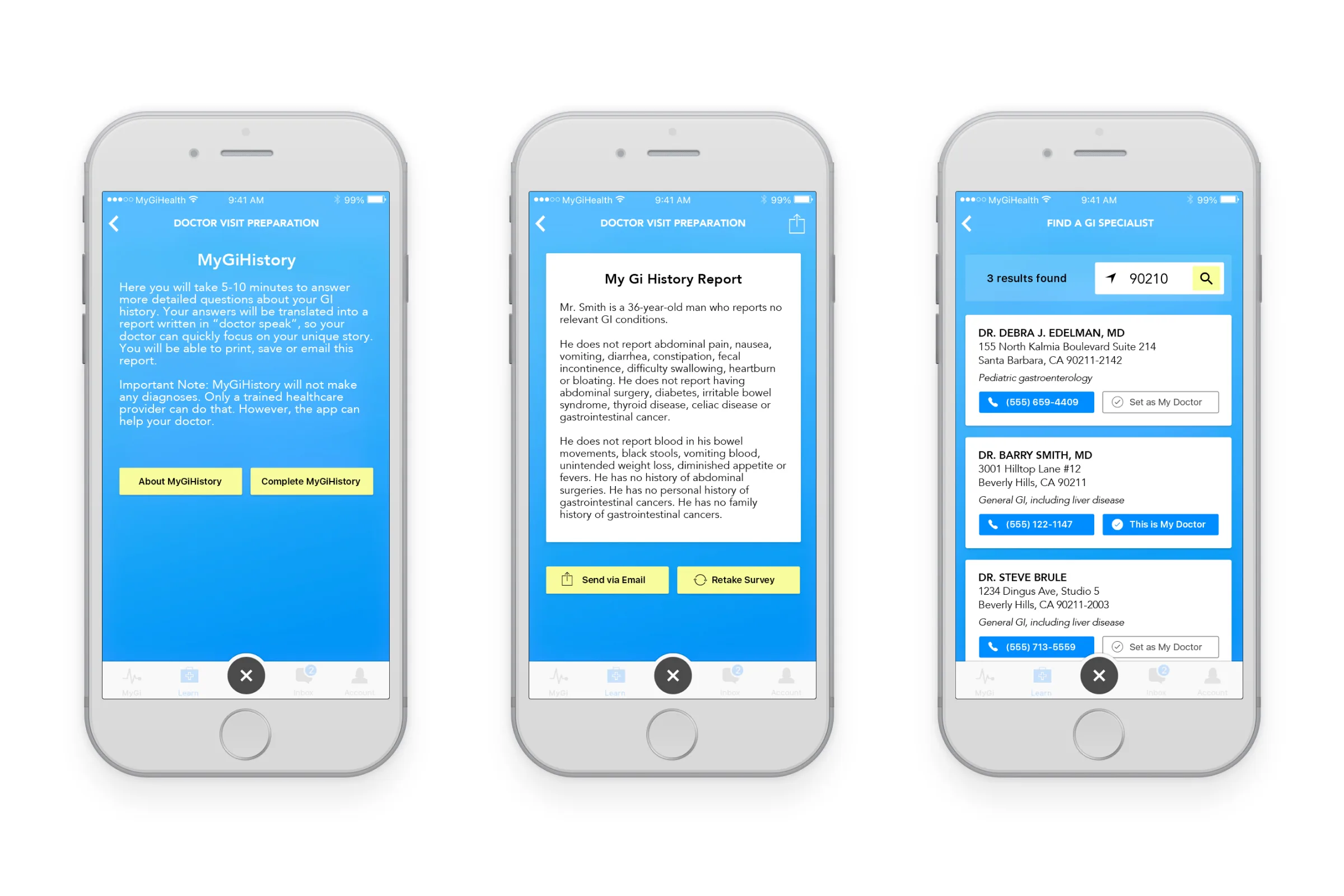
Three screens of the MyGiHealth app: doctor visit preparation, a GI history report and a specialist finder with sample listings
Visit prep, GI history report and find a specialist
The deck

The deck that closed Nestlé

Much of the user base was over 50 and not on mobile, so we built a web app with nearly all the same functionality. And because decks are a favorite medium of mine, I rebuilt the investor pitch; it resulted in a six-figure investment from Nestlé Health Science. Print, too: the patient flyer handed out in GI clinics.
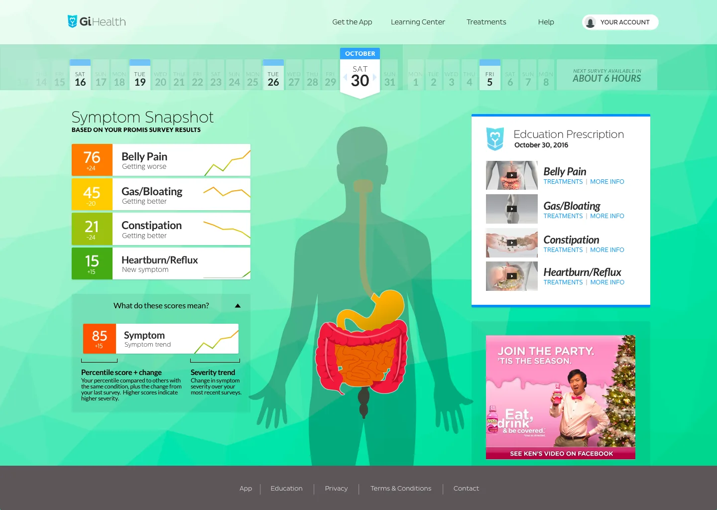
MyGiHealth web app dashboard
MyGiHealth.io dashboard
MyGiHealth web app: a belly pain score over time beside a bell curve of everyone surveyed
One symptom over time, against everyone surveyed
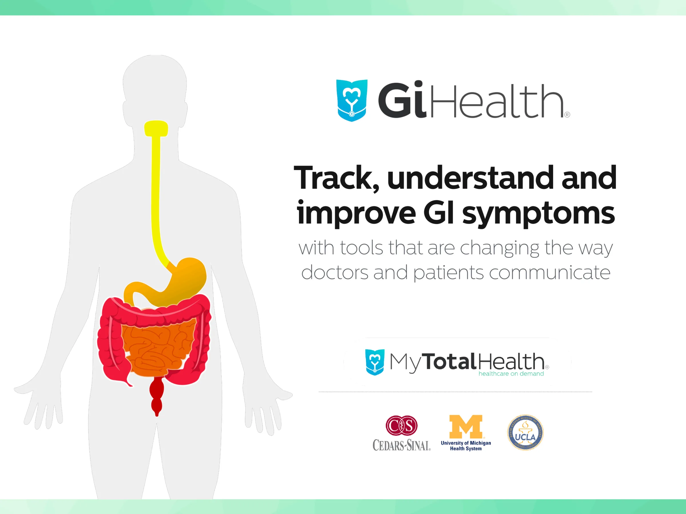
A slide from the MyGiHealth investor pitch deck
Investor pitch deck
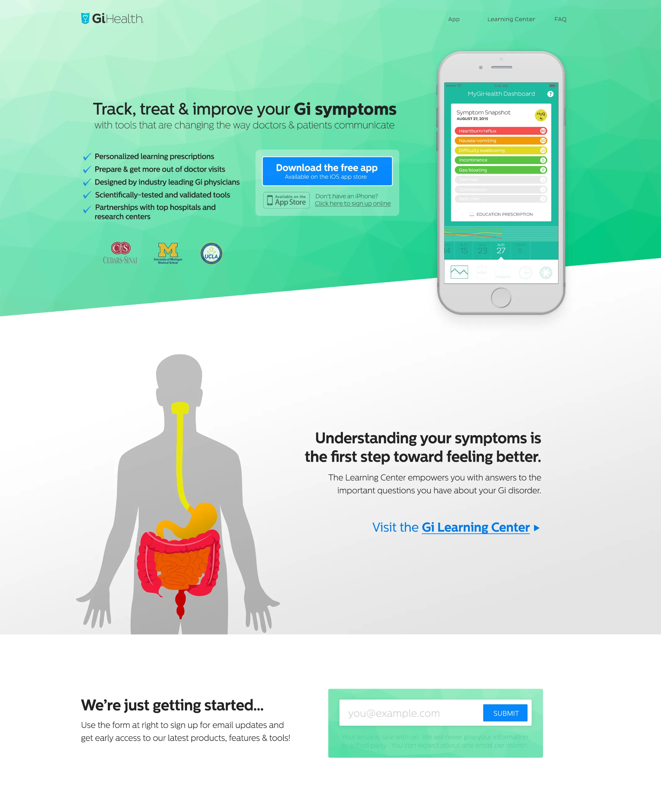
The MyGiHealth marketing site homepage
Marketing site
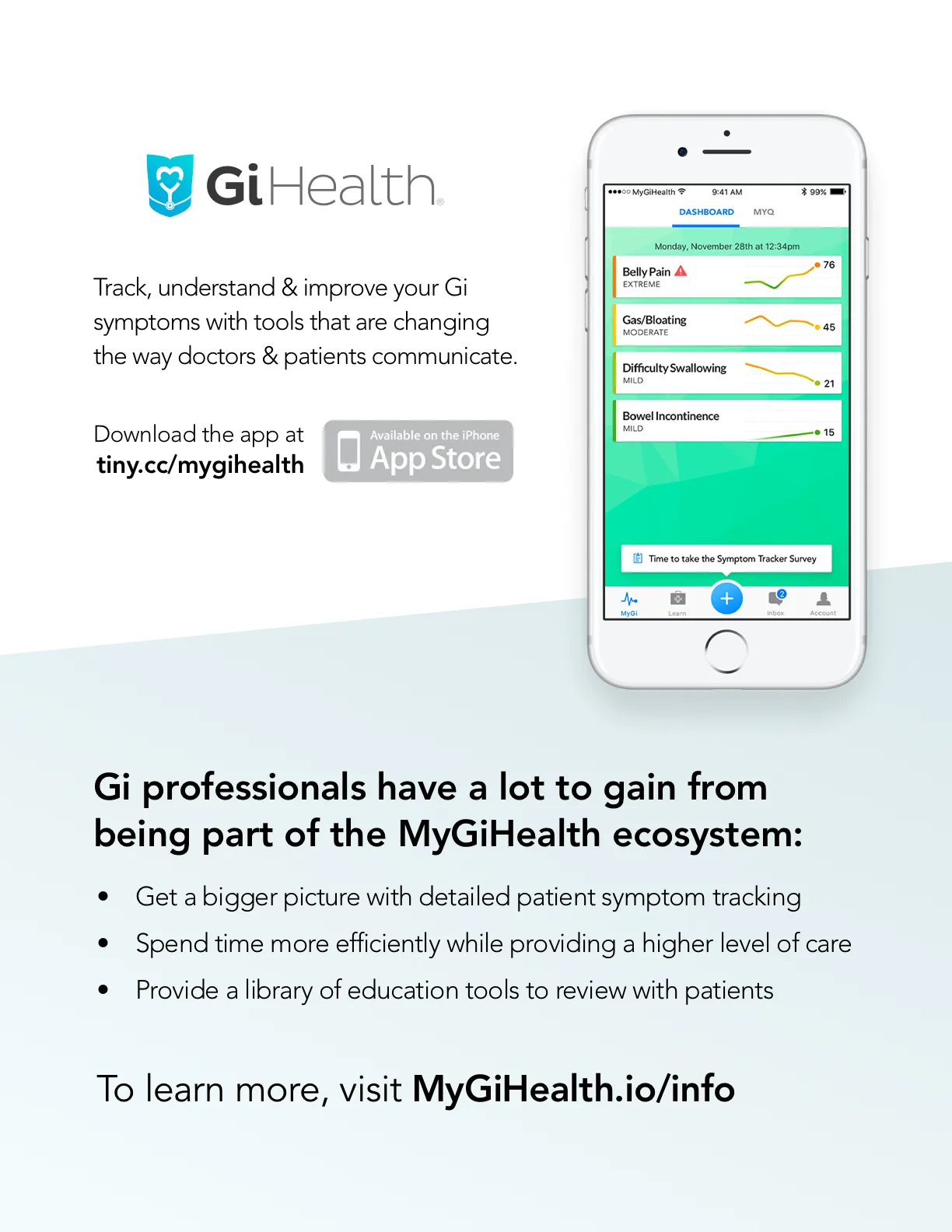
The MyGiHealth patient flyer handed out in GI clinics
Clinic flyer